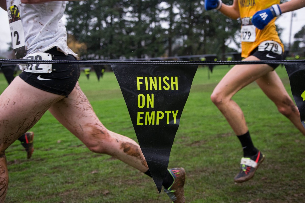
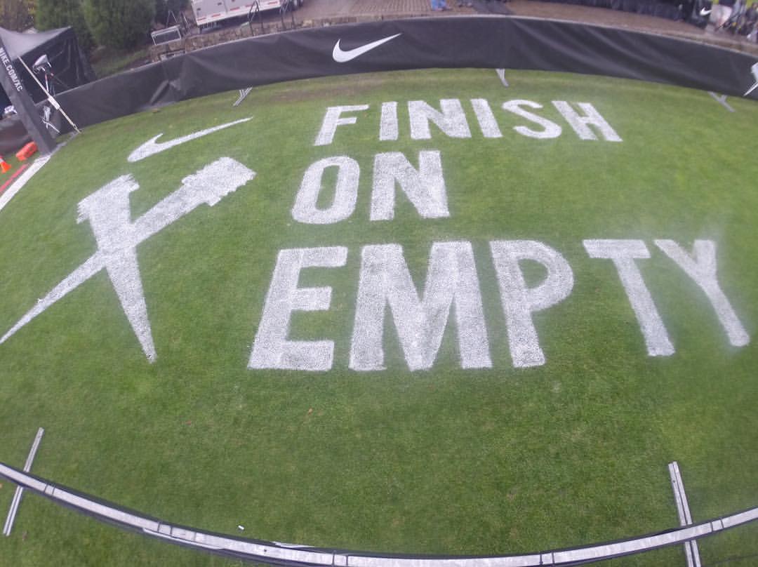
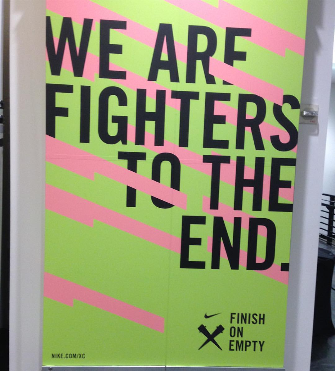
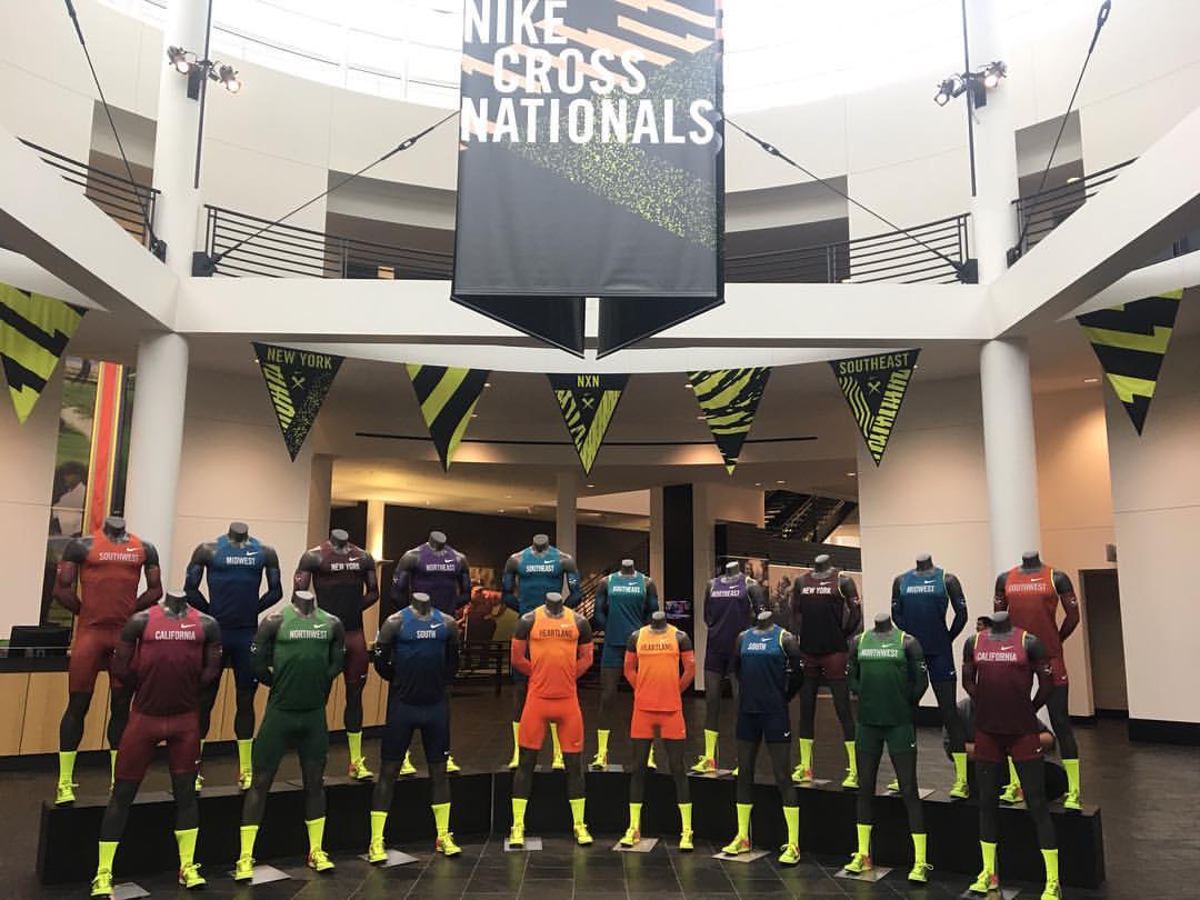
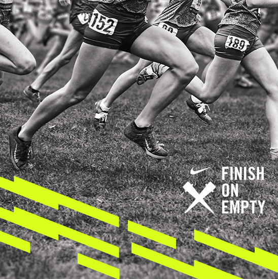
FINISH ON EMPTY | NIKE XC
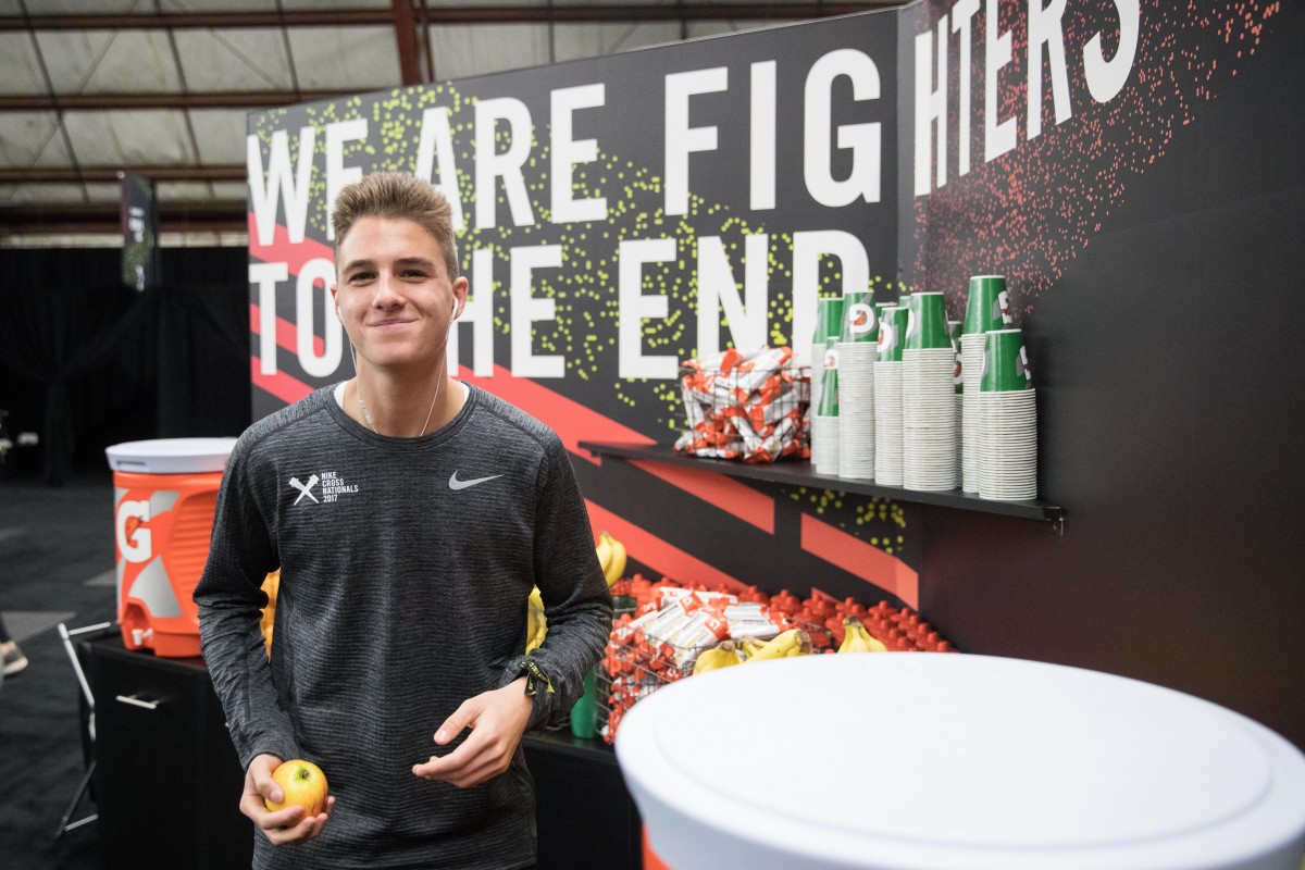
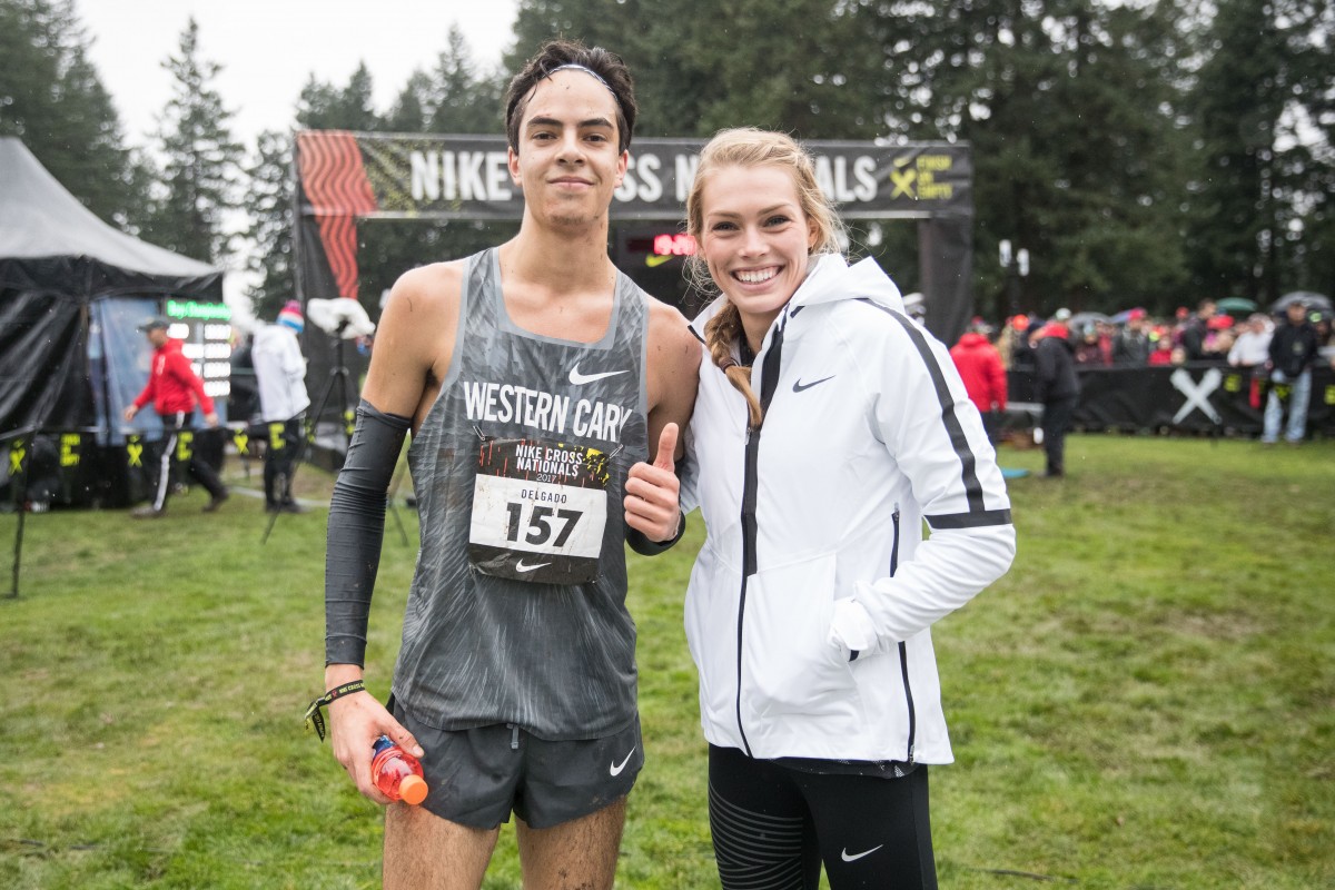
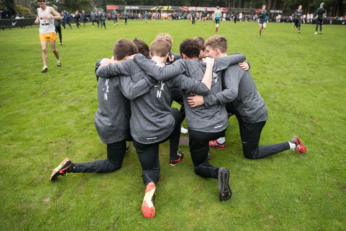
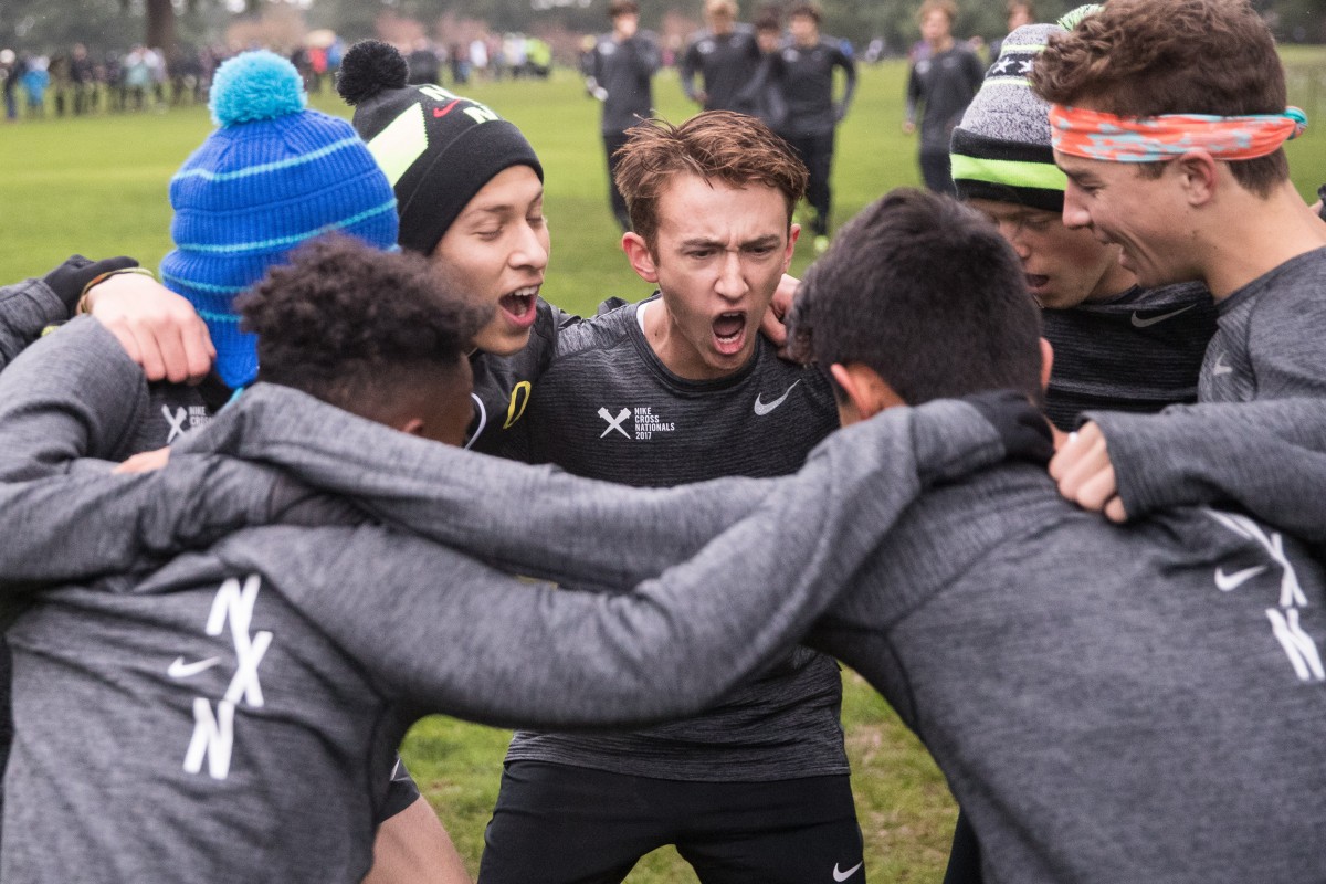
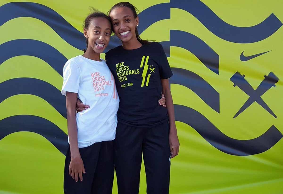
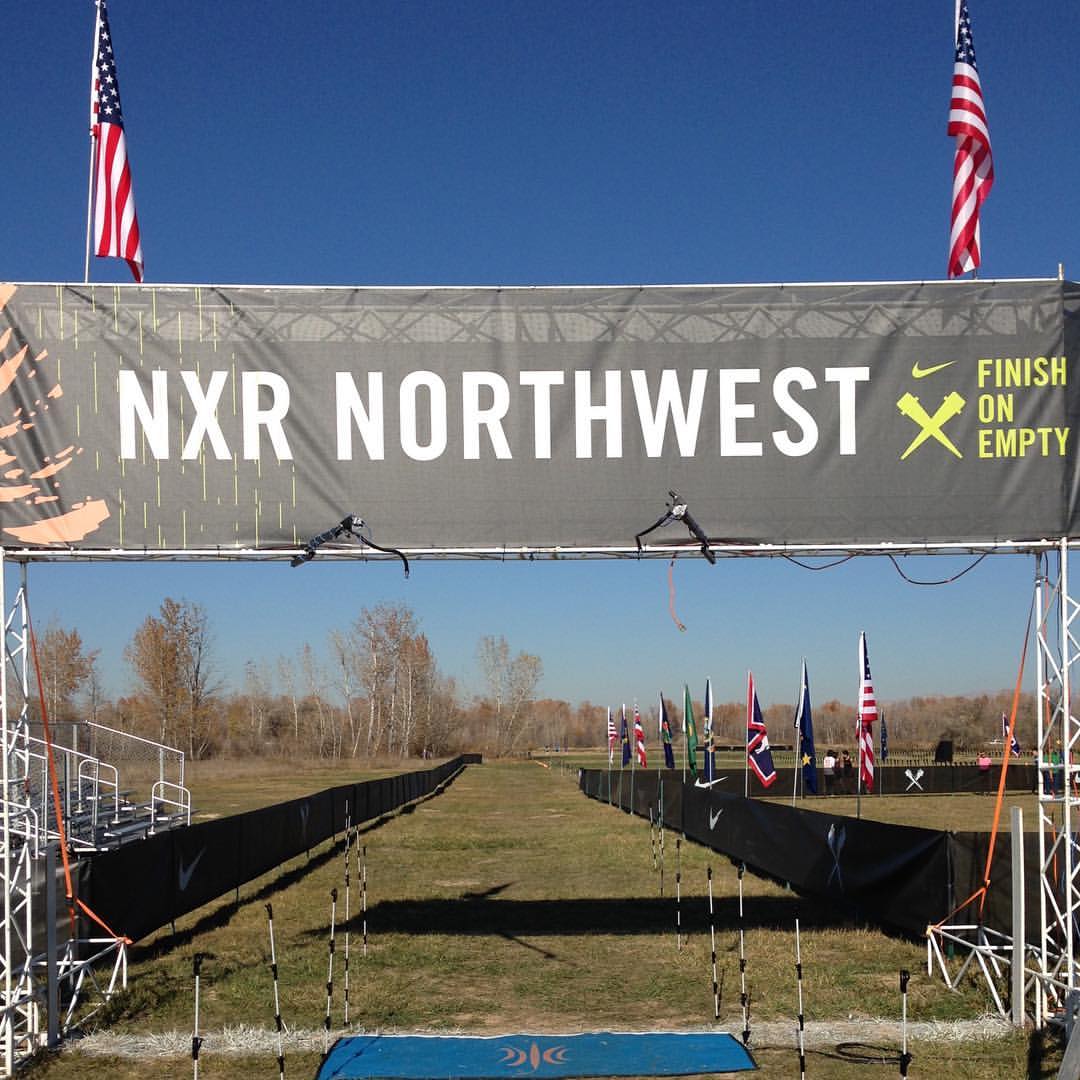
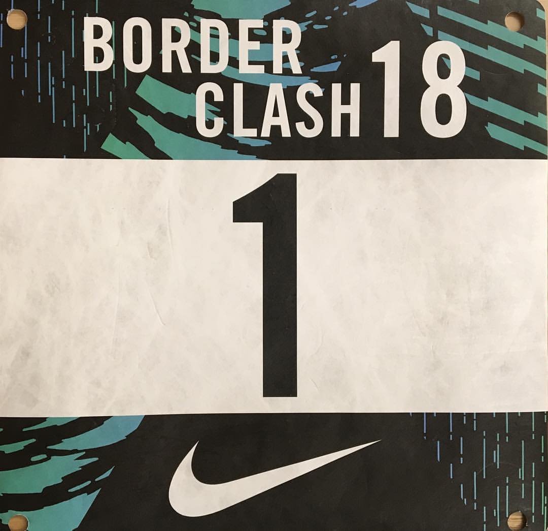
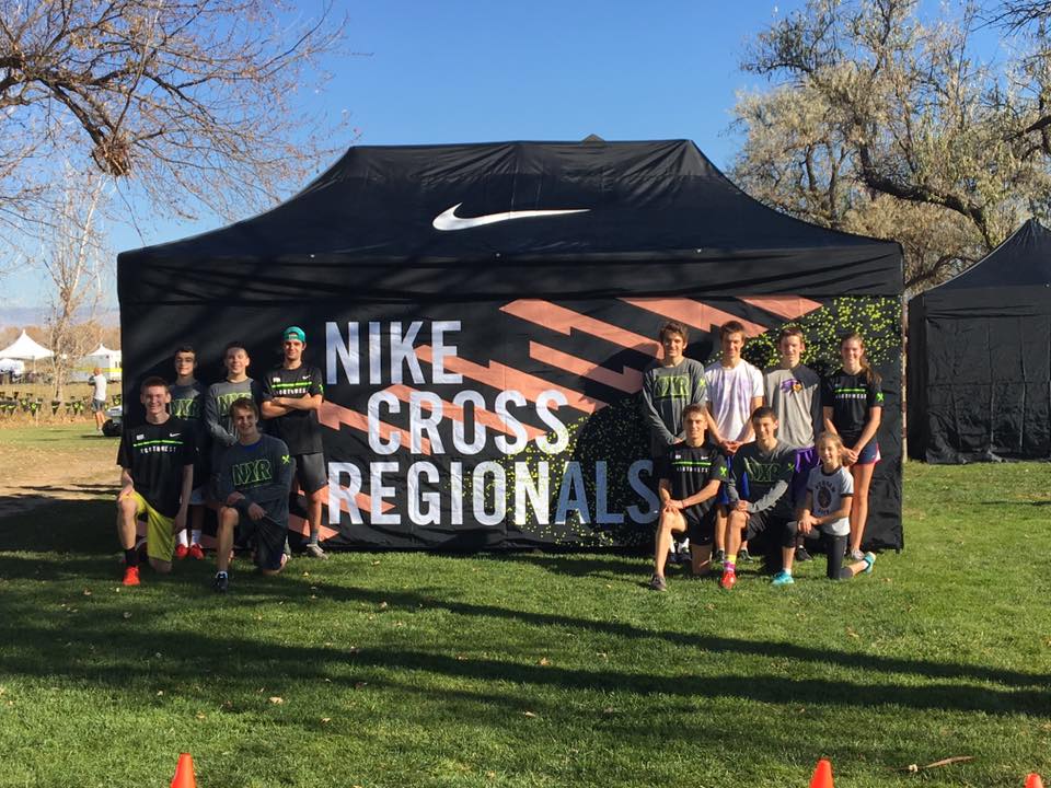
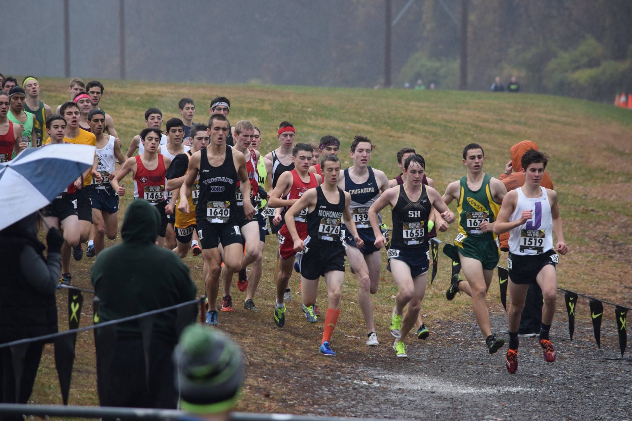
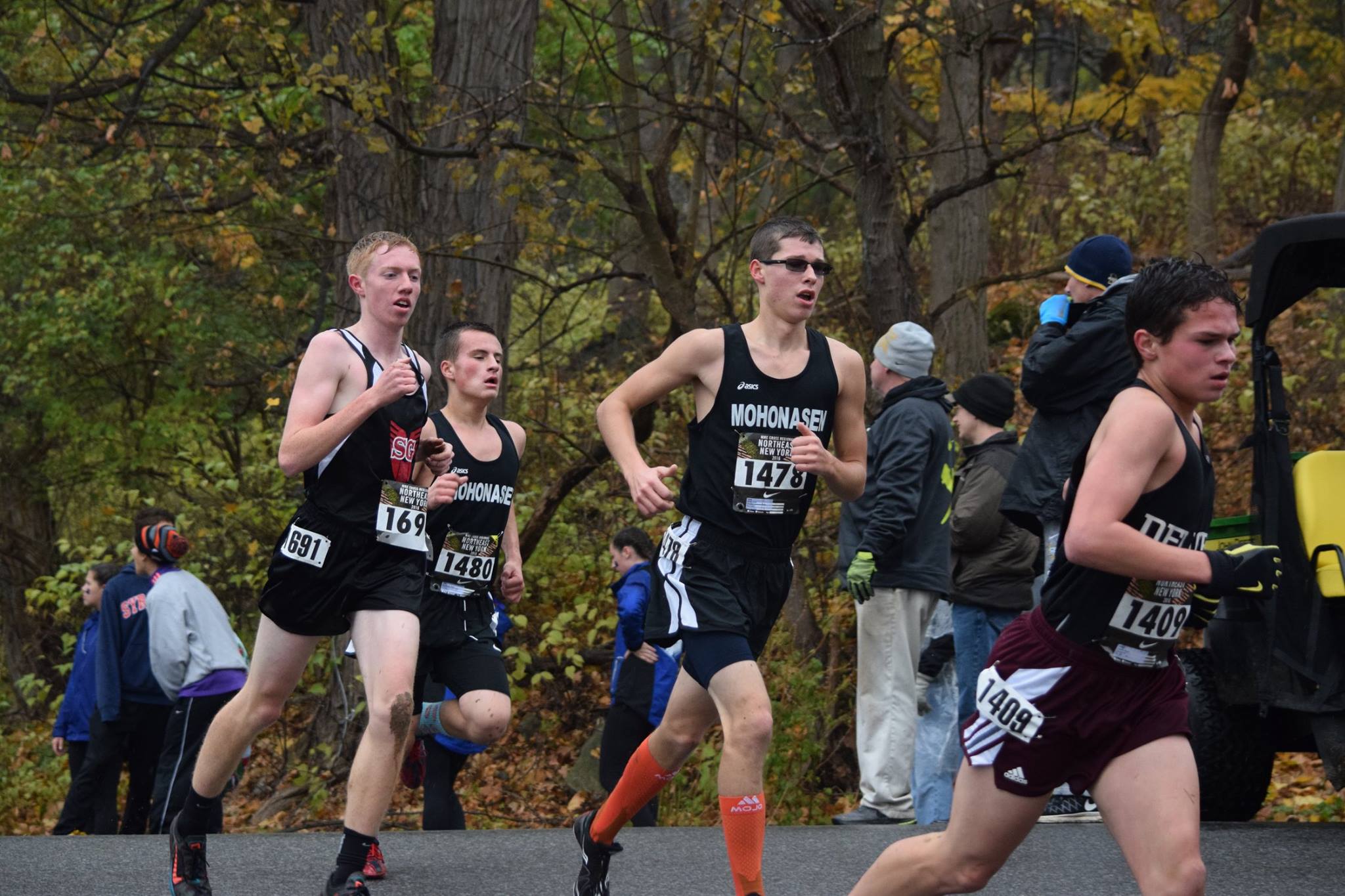
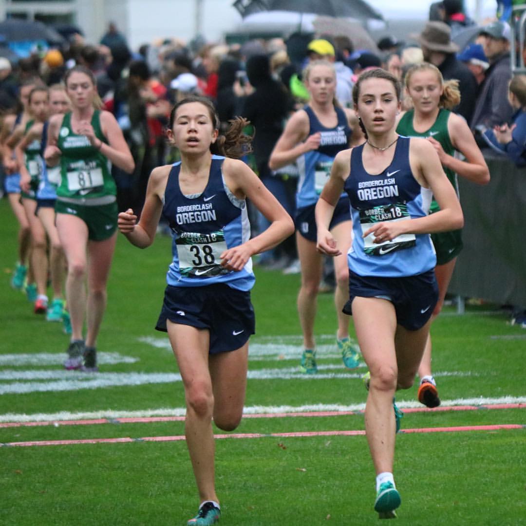
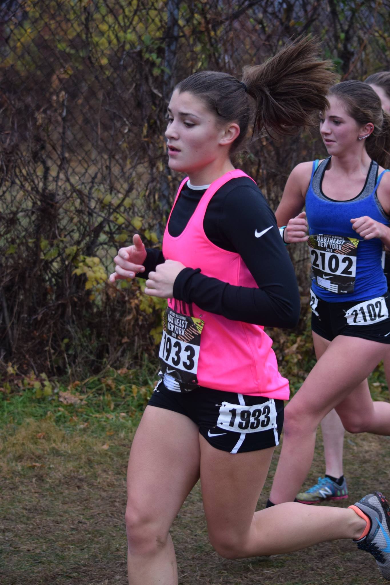
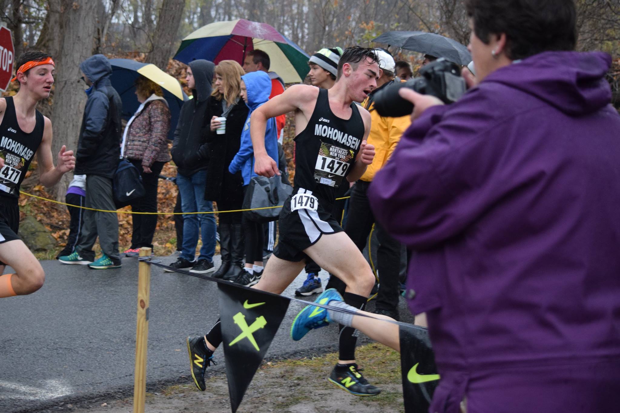
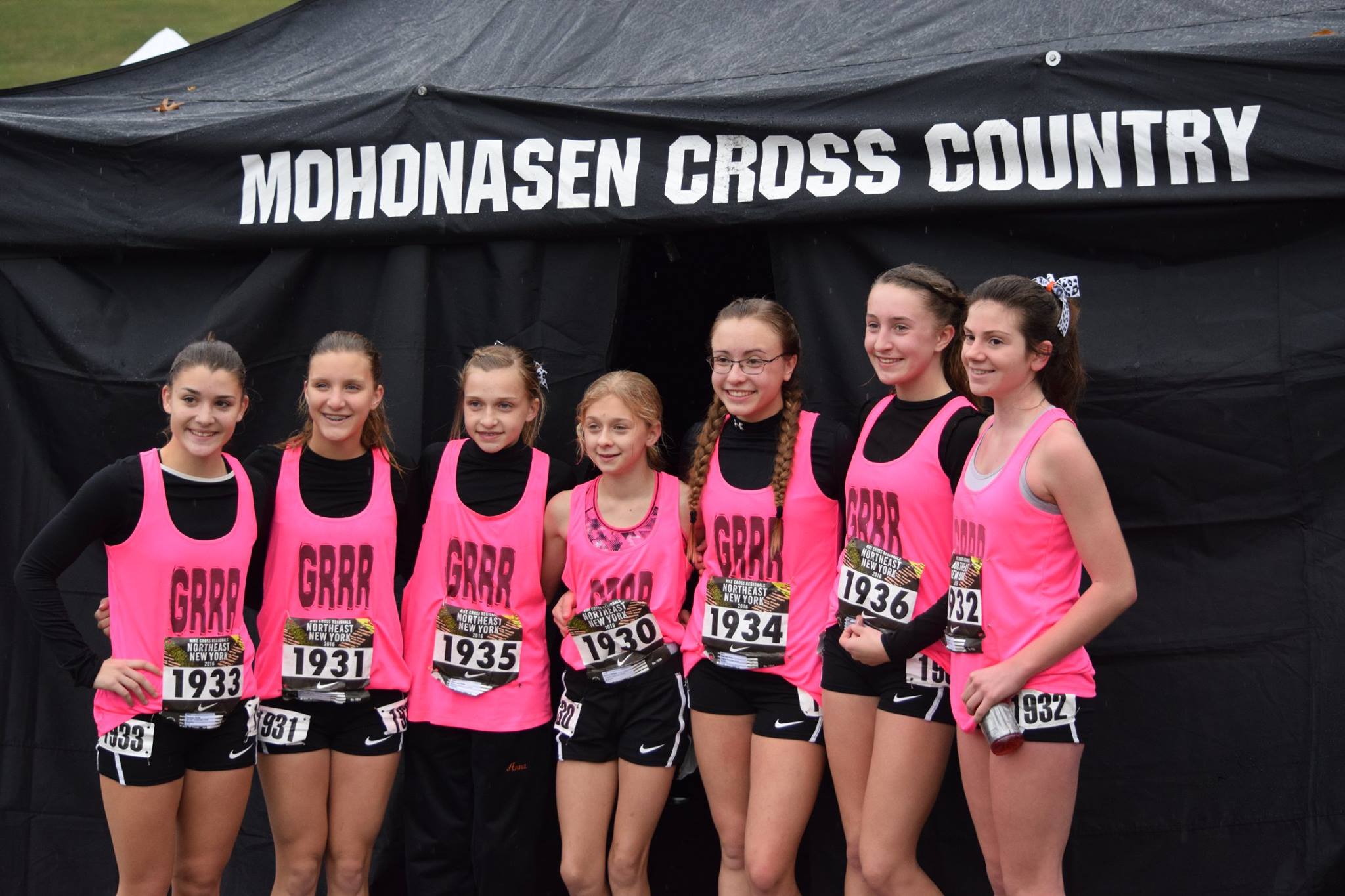
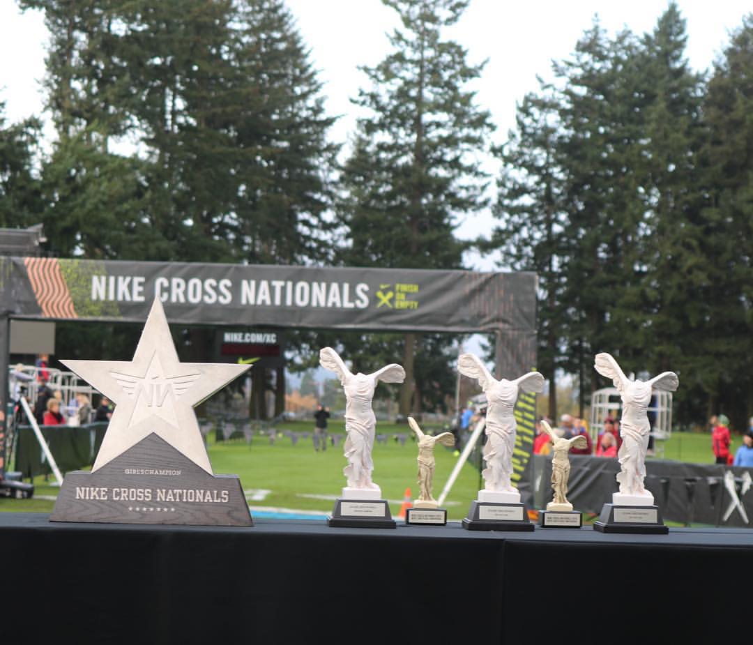
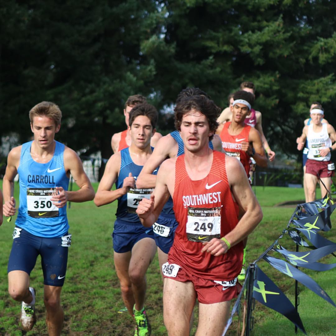
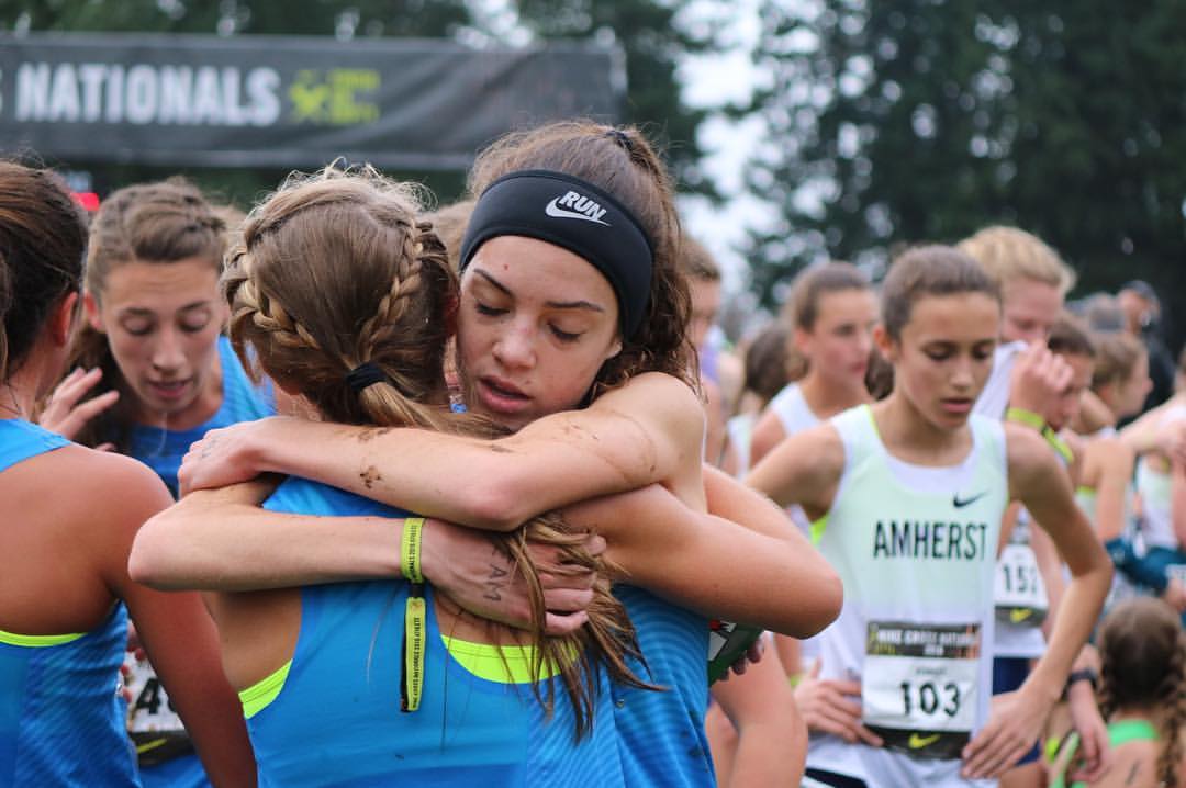
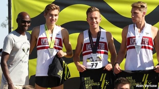
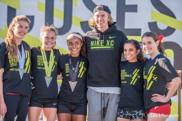
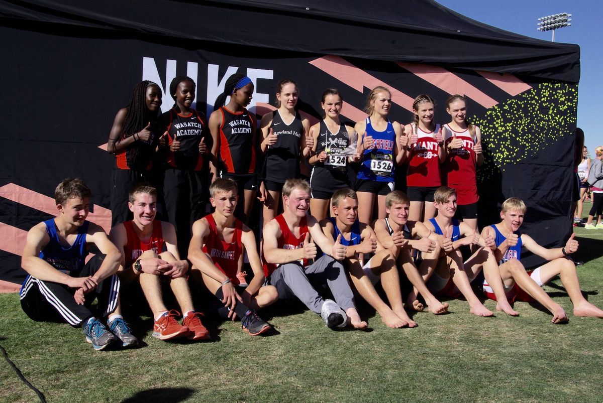
Nike asked us to reimagine the branding for Nike Cross Country. Each year 20+ high schools across the country compete in the Nike Cross Country Nationals, Nike Cross Country Regionals, and the Oregon and Washington Boarder Clash.
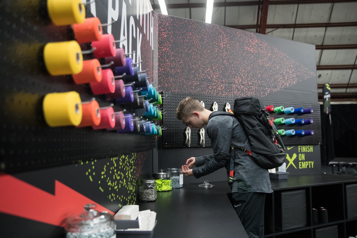
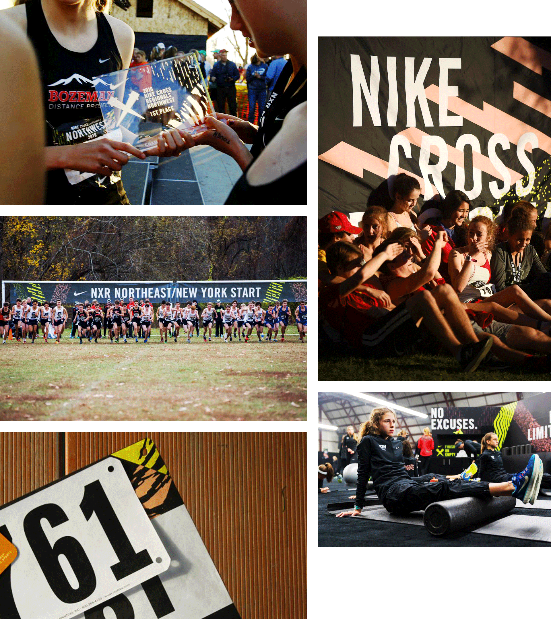
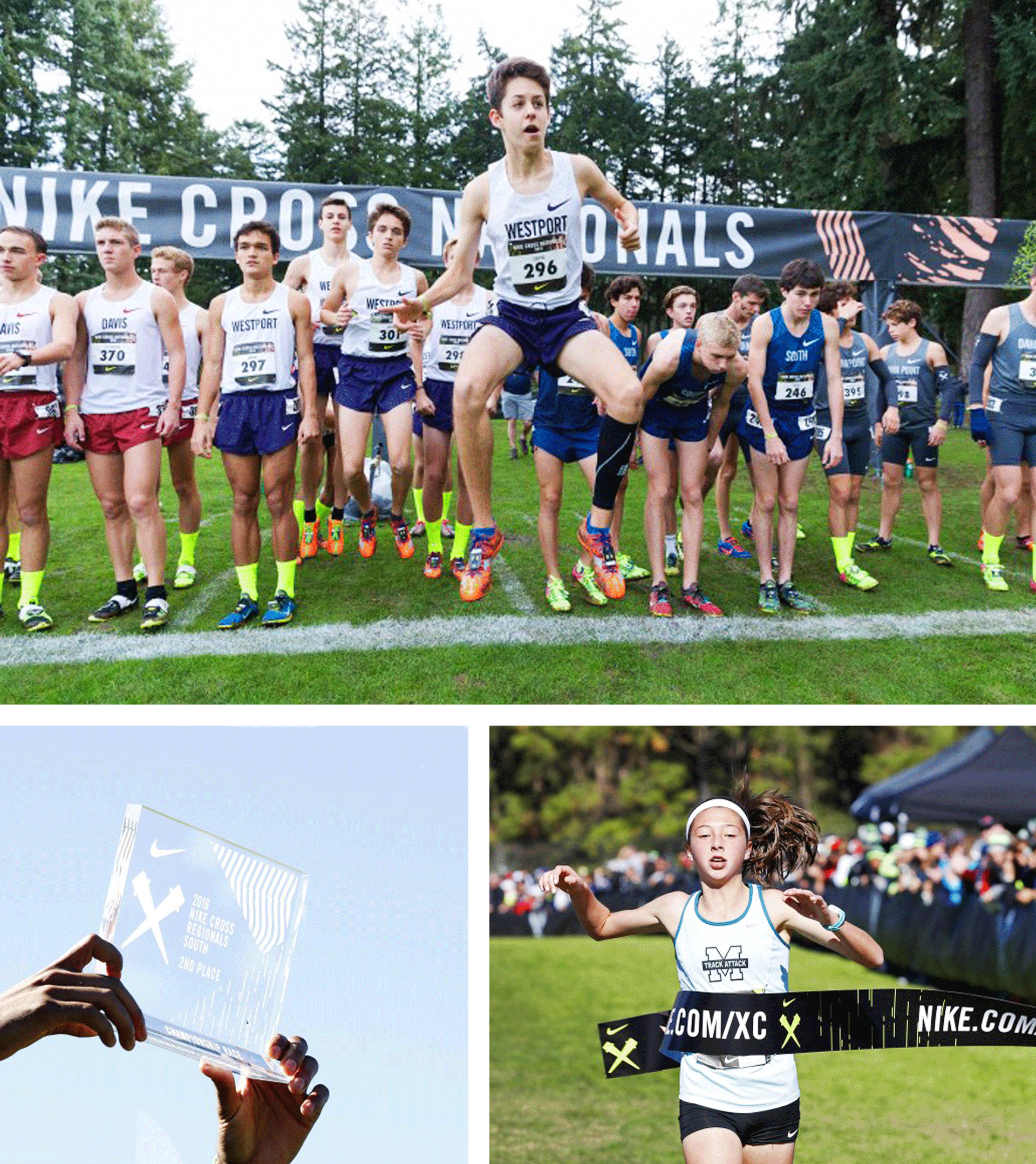
We were asked to create an evergreen system. Our response was a set of patterns, an underlining grid structure for these patterns to live in, and a bold type treatment to compliment the patterns and photography. We wanted Nike XC to feel energetic, inspirational and most of all, bad ass for the young competitors. Our patterns, the way the grid structure was used, the layout of each piece, and how we used the typography were all rooted in supporting these kids to compete with confidence.
My role
In collaboration with designer Raina Drew Jung, Karen Koch and art director Rehanah Spence; I designed the patterns, icons, posters, and the new NXN and NXR logo. In addition, we handed this kit off to the Nike Brand design team, so we also created a style guide to help them in creating beautifully designed event pieces.
Agency
Wieden + Kennedy
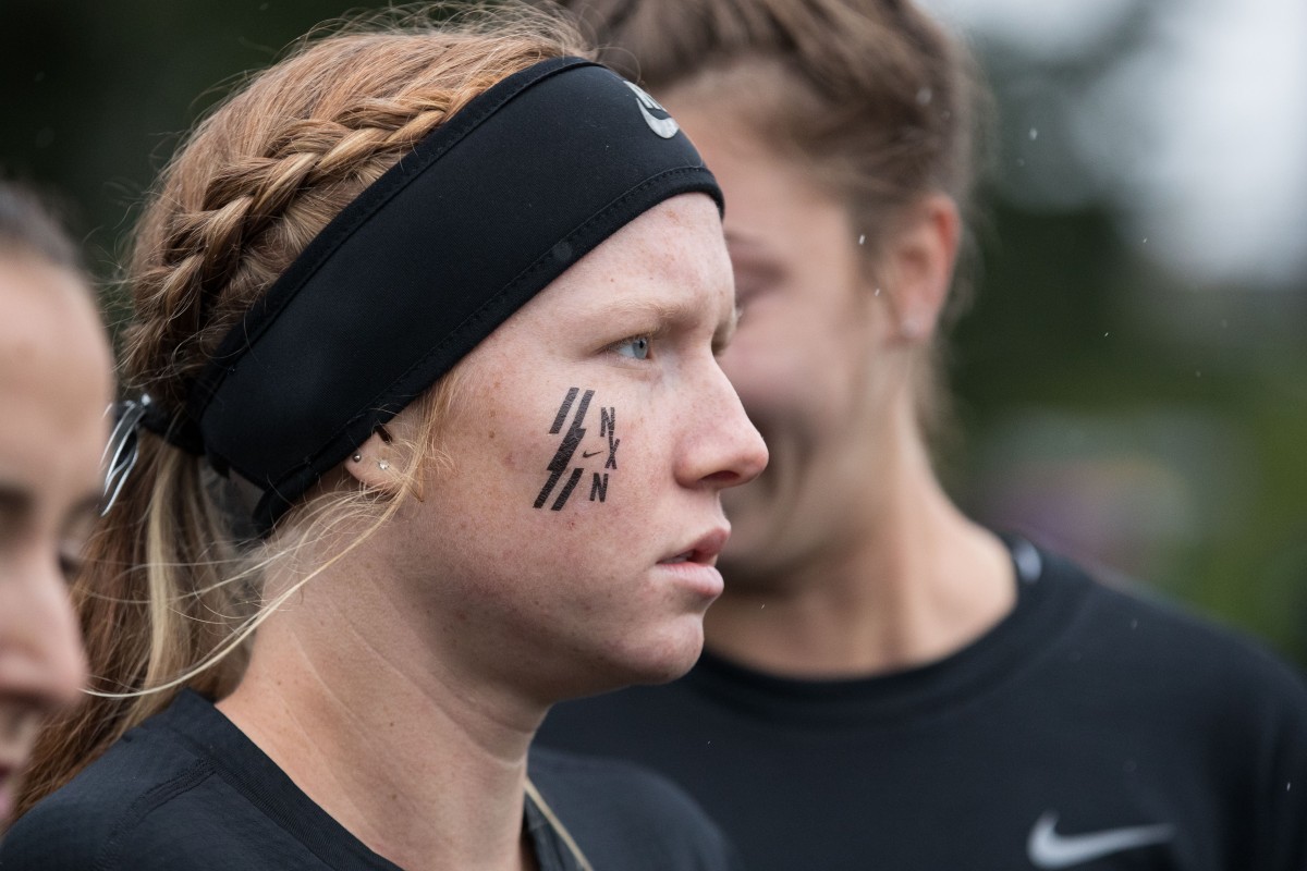
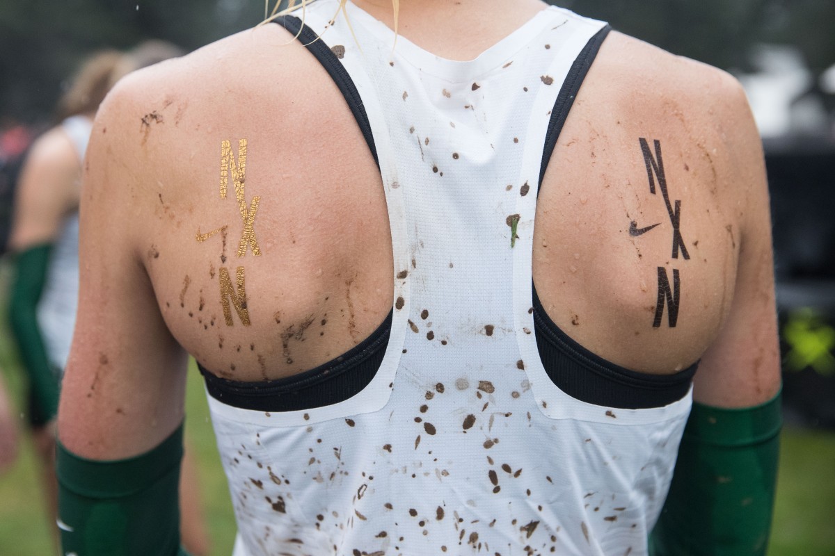
Below are Snapchat filters used during the National and Regional events.

Below are the environmental pattern write ups I wrote to be used on social media and throughout the events.
Below is some of the process.


Tough terrain pattern study

Pattern sketches
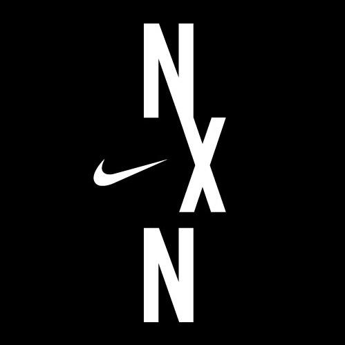
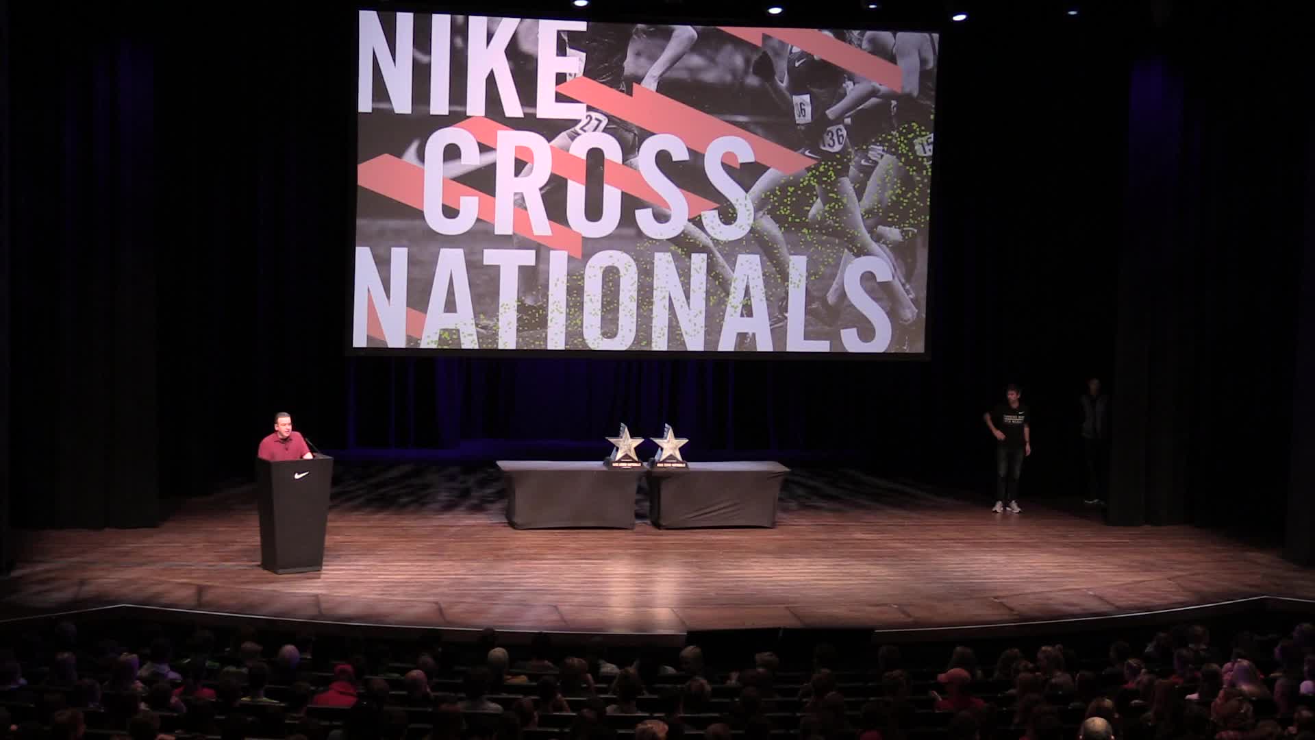
I redesigned the Nike NXN logo that was revealed during the fall 2017 Nike Cross Nationals.